Graphic Design
Some of my best work as a freelance graphic designer.

Sharp Tongue Album Cover
The indie-band Karma Queen out of Buffalo, NY needed an album cover for their second studio album, Sharp Tongue. They requested something that resembled a Tarot Card but also brought the title of the album to life. Being an indie-band, an edgy-aesthetic is always a plus.

Love Revived Company Logo
Love Revived is a holistic, trauma therapy company that is run out of Nashville, Tennessee. Spinal Energetics is their main form of therapy which focuses on healing by combining eastern & western traditions. Owner, Jolmary Santana, wanted to incorporate the spine as a key part of the logo along with representing that it can be the key to a forward-moving, peaceful life. The dots represent the spine with the colors representing the different chakras. The dividing line is an interpretation of the spinal energetics symbol and the face is facing the right to symbolize moving forward.

Karma Queen Logo
Karma Queen's band manager, Evan Kaminski, wanted a logo that was gritty but clean, feminine, with most of their listeners being women and something that stood out in a crowd. We came up with the concrete background for the grunge aesthetic of the band, the pink crown for a touch of femininity, and a neon glow for a pop. The style of the crown and the clean lines of the sans serif text keep the logo grounded and contemporary.

Projector Album Release Poster
This promo poster was done for the release of Karma Queen's first full-length album, "Projector". For this project, I was given free reign. I decided using the title in an "on-the-nose" way would be ironic and therefore, a little interesting. To keep it in line with the band's branding, I kept the feel dark, mysterious and dotted with their signature pink. The background also keeps the overall vibe young & nostalgic with it calling back to a high school or college classroom.

Tony Wynn's Promo Mailer
Tony Wynn of Snell Realtors out of Albion, NY was looking for a mailer to be sent out to prospective clients that was sophisticated, modern & stood out. Most promo mailers heavily border the image so in this case, the image covers the entire space. Traditional mailers are usually cluttered with information. This was kept clean to draw your attention to the most important details. The thin border over the image anchors the design without feeling to heavy and the image bleeding out through the border keeps it contemporary.

Tony Wynn's Promo Mailer - Back Side
Since the front of the postcard was kept clean & free of clutter; all of the other essential information that a prospective client would want to know is here on the back.
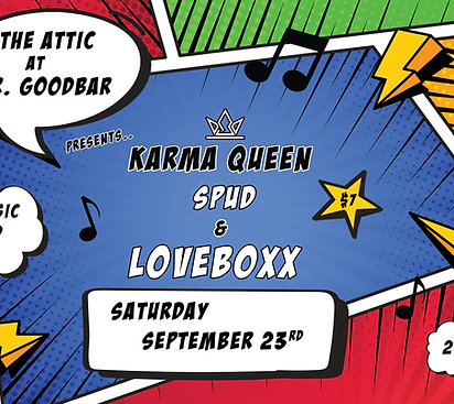
Karma Queen Show Poster
This project is pretty straightforward. The band wanted a comic book feel to advertise their show with fellow bands, Spud & Loveboxx.

Klub K-9 & Friends Logo
Klub K-9 & Friends is a pet-boarding company out of Buffalo, NY that wanted something light, airy, definitive & a little whimsical for their company logo. I kept the logo light & airy by taking advantage of the white space. You immediately have an idea of what the business is about with the use of the name and the animal imagery at its center. The colors and the font type give the logo its whimsy.

Love Revived Business Card
Business owner Jolmary Santana wanted a calling card that represented what the company was about; finding peace & renewal. The colors used create a sense of calm and the logo centered reminds the viewer of the fresh start that can come when giving spinal energetics a try. The back of the card is where all of the pertinent information is kept.

Karma Queen Expanded Logo
This is the full concept of the compact crown logo up above. The band manager wanted something that resembled a playing card. All the themes were kept the same across both logo sets to form the brand's identity cohesively.
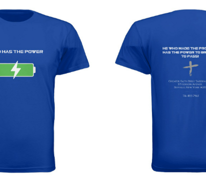
Greater Faith Tabernacle Tee
This T Shirt was designed as a dedication gift for the parish's pastor. The congregation came to me with the message they wanted on the tee and asked that I created an image to go with it. A charged battery in the style of the icon on a cell phone felt like a play on the message that made the tee feel contemporary and cool.
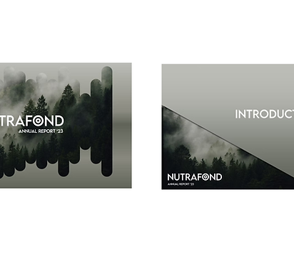
Nutrafond Powerpoint Template
This project was personal. Not for a client. It is a replica of a Powerpoint deck I created during my time at Citibank for deal with a company of a similar name.